Killing the confirm password field is not enough
This article from UX Movement (Why the confirm password field must die) was brought to my attention in an issue in one of my dashboard projects on GitHub.
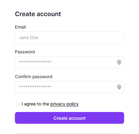
The situation
This is what I have right now and what I've been doing for quite some time, without thinking too much about it:
The problem
There are two main problems with this approach that result in lower conversion rates in the end: password masking and confirmation.
As stated by a research from Nielsen Norman Group (Stop password masking), "users make more errors when the can't see what they're typing while filling in a form. They therefore feel less confidend." These bad experiences can lead to lost business as people may never log to your site.
Another problem pointed by the same article is that "The more uncertain users feel about typing passwords, the more likely they are to (a) employ overly simple passwords and/or (b) copy-paste passwords from a file on their computer. Both behaviors lead to a true loss of security."
And all of that comes only from password masking. Add confirmation on top and now you doubled the bad experience.
The solution
The main point that the first arcticle missed is still related to UX, but not as much with design. I'll talk about it later, but for now, let's analyze some design solutions:
1. Delete the confirmation but keep masking
With this approach, you reduced the fields by half, but created a bigger problem: users still can't see what they are typing, but now there isn't confirmation.

2. One password field, but unmasked
Now the users see what they are typing, as do anyone that may be looking at their screens. This would be a serious privacy problem.
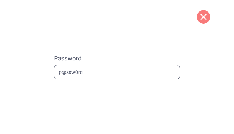
3. One masked field with visibility toggle
This is the preferred method in the UX Movement article, and maybe in 2015 it could be, but from personal experience, this is as bad as the option above (#2).
It consists of adding a button (text or icon) inside the password input, usually aligned to the right. This way, the user can change the visibility of the field between masked and unmasked. But if you payed attention to the image above showing the current state of my interface, you noticed that there's already an icon there, placed by my password manager (LastPass; I'm not sure how others do it).

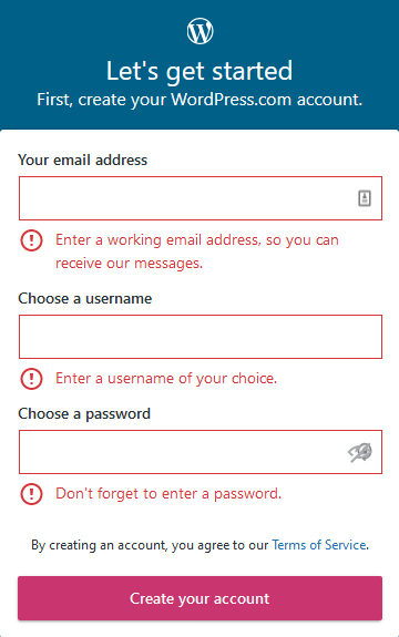
Wordpress.com does exactly this.
If I try to click the password manager icon to generate a password or fill the field, it may toggle the visibility of my password and if I'm lucky and precise enough, I may find the exact pixel that is not hidden under the form icon to actually click the right icon.
Google went this way, but with a clever approach: place the icon outside.
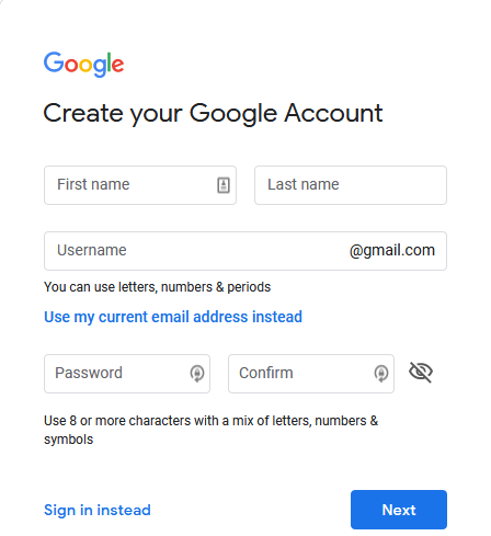
I'm not a fan of conveying meaning through icons alone, but there you have an alternative.
4. One masked field with visibility toggle - alternative
This is my preferred way. May not be the perfect one, but checks a lot of boxes 😉
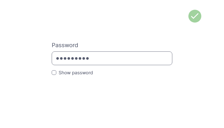
Using a checkbox saying exactly what is going to happen, still close enough to share the context.
- The field is masked, so it's secured
- The user can unmask it, so there are less chances of mistakes
- The toggle is clear about its actions, unlike an icon
As a user, I should never have to devote a millisecond of thought to whether thigs are clickable - or not. Steve Krug on Don't make me think
5. Social login
You can still use the last approach (#4), but the best one would be to offer the user an option without (another) password (of course you can still offer them to login with email and password).

You can choose whatever you want, but as I write this, the most common are Google, Facebook and Twitter. This article on social login user's preferences (Social login — Do users prefer Google, Twitter, or Facebook? Here is what we’ve learned on Cruip.com ) has some more insights.
This is just half of the problem
One thing the UX Movement article ignored is how you handle accounts in your system. It doesn't matter which option you chose from above, if somebody types the wrong credentials (and even confirms typing it wrong twice - think of CAPS LOCK) during the account creation they should be able to regain access to their account. And this process is part of UX.
Facebook, for example, uses the #1 approach. I'm not familiar with it, but if some people that I know can still log into their accounts, their "Forgot password" flow must be very good.